|
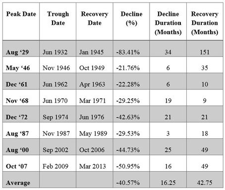
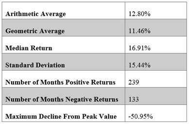
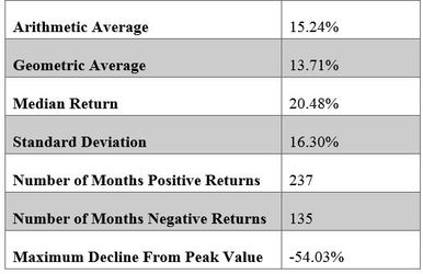
Bear Markets Since the last day of 1926 through today, the S&P 500 has had a total of eight bear markets. This is assuming a bear market is one with a decline of 20% or more. Since it has been eighty-five years since the first of these great bear markets, and five since the bottom of the last one, it might be interesting to see some details on each. Let’s take a trip down memory lane. Source: James P. O’Shaughnessy, What Works on Wall Street, Fourth Edition, pg. 65 Often when we look back at the past, we remember the good times, forgetting the bad times. As an investor and advisor I am totally surprised every time I look at these numbers. It’s not so much the decline or the duration to recovery, but the fact that I have been able to stick around through all the suffering and still, without a doubt, continue to have faith that owning shares of public companies will reward the owners despite these periodic bouts of massive declines in market values. Of course results do speak louder than words. Let’s lean on the quantitative research of James P. O’Shaughnessy and take a look at the returns of the S&P 500 for the first three decades I’ve been in the business of professional investment management. Summary Annual Return and Risk Results Data: S&P 500, January 1, 1979 to December 31, 2009 The Ryan Indices monitor each “currently auctioned” U.S. Treasury Bill, Note and Bond Maturity series is an Index Series. There are several reasons why the Ryan Indices are based on the currently auction issue: The U.S. Treasury Yield Curve is a dominant force in the term structure of interest rates. The inclusion of solely Treasury issues eliminates credit risk, making the index default-free index. The inclusion of solely the auction issues eliminates liquidity risk, making the index the most liquid index available. The exclusion of stale inactive issues allows the Index to maintain income levels that correspond to interest rate levels in the market. Source: James P. O’Shaughnessy, What Works on Wall Street, Fourth Edition, pg. 78-79 These returns by themselves look pretty good; earning the average is not so bad. They look even better when you consider that these average returns began just a few short years after the crash of the 70’s and include three of the eight great bear markets of the last 85 years. Even more impressive is that these returns end just ten months after the market declined by 50.95%. These two tables tell us a lot about long-term investing. From the first table, we can see that every bear market recovers. We can also see that a recovery in market value, on average, takes longer than the decline in value. It has been wise to buy into the declines if one has a little cash laying around. Also, if one is fully invested, it is better to stay invested rather than sell and wait for a recovery, when we cannot tell with any accuracy when the decline will stop and the recovery will begin. Nor do we know how long the recovery will take. The second table reassures us that the market responds to growth in business value. Hanging on through thick and thin for the past three decades would have produced a return well in excess of inflation. The table also tells us that we would have been hard pressed to find a non-levered investment that produced a superior return for a person who only provided capital and no labor. Of course, there is always a price to pay, and the table gives us a hint of the cost of hanging on. The standard deviation of 15.44% sums this up. The general level of price changes from the average for any given year in the S&P 500 during this time was up or down 15.44%. This is the price paid for hanging on. You must be prepared at any time for the market value of your stock portfolio to experience a decline of 15% or more. Percentages don’t mean a lot to most of us, so let’s put that into dollars. You must be prepared at any time for every $100,000 you have invested in common stocks to decline by $15,440. Corrections This discussion of volatility takes us to our next concern: market corrections. Corrections are temporary, less severe declines that usually have a shorter duration than bear markets. Corrections are so numerous that they should be considered normal. Carter Worth, in his recent article “Money in Motion” dated October 13, 2014, stated that there have been 209 corrections of 5% or greater since 1927. If you do the math, this is an average of 2.47 corrections per year for the past 85 years. I personally have given up keeping track of how many corrections I have lived through in my professional career. I just know there have been a lot of them. Corrections happen, and they must be dealt with emotionally and financially. I wish I could tell you not to worry when the market falls, but I would be hypocritical if I did. I myself have the same stomach churning and loss of sleep, and I struggle to stop myself from doing something, anything, to fix the problems. However, I know that when I have reacted and tried to change things, I have done more damage than good. This doesn’t mean we can’t take advantage of the normal market declines to improve the quality of our portfolios. It also doesn’t mean we can’t minimize taxes by selectively offsetting taxable capital gains with capital losses, as long as we have alternatives to maintain market exposure. It doesn’t mean we can’t put any cash to work long-term, as long as the corrections provide bargain prices to make new investments. It does mean that we should, if we can, hold off on any major purchase that requires the sale of securities. Most of you know I have taken a little pride in sharing my investment knowledge with Justin. He has absorbed every little thing I have shared over the past ten years, and we are now at the point where he is returning the favor by teaching this old dog a few new tricks. While I am proud of his growth as an investment professional, I am sorry to say that his best training has nothing to do with me. That training came from living through multiple corrections and the great crash of 2007. I do believe that having this experience early in his investment career positively affected his ability to manage portfolios for you and for our future clients. While I have taught Justin everything I have learned, the teacher in me just can’t stop. Libby is now in the learning phase, but she has an advantage, as she is receiving knowledge from both me and Justin. I am sure that she will add far more than she takes in providing better than average results for you. Benchmarks We have been talking about the S&P 500 index, one of the best known and most used benchmarks for common stock returns over time. Benchmarks, when used correctly, can help us measure our own investment results over time against an average return. However, a warning is also necessary, as the misuse of benchmarks can cause far more damage to our financial well-being than good. This is driven by our desire to outperform the average and maximize our returns by chasing the best performing group of stocks or bonds for the past year or two. Most individual investors will not have 100% of their funds invested in any single type or class of security. For example, you don’t usually see someone who simply has 100% of their money in Large Cap U.S. Stocks, or 100% in bonds that mature at the same time and pay the same rate. An individual is much more likely to invest funds in various investment classes including stocks, bonds, cash, real estate and other types of investments. With that in mind, in search of a proper benchmark for comparing returns, one should make the effort to measure results against a benchmark weighted to match goals, the amount of risk one is willing to take, and one’s portfolio in its entirety. There is an unlimited number of benchmarks we can find and monitor. We have discussed the S&P 500, but I thought it would be meaningful to discuss the benchmarks we provide for you when you receive your quarterly reports. We believe each reported benchmark is helpful for you in measuring your returns and our efforts as your manager. The benchmarks provided to you are: 1. Ryan US Treasury 2 Year 2. S&P Global 100 3. S&P Super 1500 Composite 4. 60% Global 100/40% Ryan UST 2 5. 60% S&P1500/40% Ryan UST 2 The Ryan US Treasury 2 Year (from their website www.ryanalm.com): As a firm, we have chosen to share this index’s results with you because we believe it matches how an average non-professional investor would invest his or her own funds in fixed income securities. Over the years, individuals who are more conservative hold fixed income securities or bank deposits with a short maturity. Two years seems to be the average maturity most would hold without some form of guidance to shorten or extend the maturity to capture rates of return. More importantly, absolute security of principal seems to be the primary driver of investing in US Treasuries or Certificates of Deposits, whose rates are based on the current income paid on US Treasuries. The S&P Global 100 (from their website www.spdji.com): The S&P Global 100 is designed to measure the performance of 100 large-cap, multinational, blue-chip companies in the S&P Global 1200. The S&P Global 100 mirrors the sector weights of the broader universe of stocks from the S&P Global 1200 in order to approximate the sector mix of the global economy. As a firm we have chosen to share this index’s results with you as it matches how we select and manage your portfolio of individual securities. We limit our holdings to Global Leaders, those large powerful and important companies whose business activities are conducted in locations throughout the world. The blue chip companies we own can be organized anywhere in the world, including the United States. The S&P Composite 1500 (from their website www.spdji.com): Representing approximately 91% of the available U.S. market cap, the S&P Composite 1500 combines three mutually exclusive leading indices: the S&P 500®, the S&P MidCap 400® and the S&P SmallCap 600®. This index is a broad measure of the investable U.S. equity market. By looking beyond large caps to include mid caps, the index captures stocks that have successfully navigated the challenges specific to smaller companies, but are dynamic and not so large that continued growth is unattainable. By including small caps (but not micro caps), the index captures stocks that may have high growth potential but also meet investability and financial viability criteria. As a firm we have chosen to share this index’s results with you as it matches how we believe the average non-professional investor’s common stock portfolio would look absent any guidance. Most individuals broadly diversify their holdings with some funds allocated to smaller and middle sized companies along with some blue chips, and are biased towards owning US domiciled corporations. The 60%/40% Indexes: These are as stated: the weighted results of owning a portfolio that is invested 60% in the S&P Global 100 or 60% in the S&P Super 1500 Composite, and the remaining 40% invested in the Ryan US Treasury 2 year. Of all the benchmarks we provide, these weighted 60/40 results are probably the most meaningful to you. The portfolios of most individual investors will include both stocks and bonds. 60% stock and 40% bond is a standard mix of assets that has received much criticism over the past few years, but is still used widely by the majority of investors. Market Leaders At the beginning of this letter, I shared the returns and risk of the S&P 500, the most widely followed benchmark, for a thirty year period. It is not fair to only show these returns, especially since we do not invest your funds solely in large US domiciled companies. So once again, I want to share with you the research of James P. O’Shaughnessy, on what he calls "Market Leaders." Although these results do not directly report on the S&P Global 100, the index we present to you, I do believe they have meaning for us. O'Shaughnessy defines “All Stocks Universe” as stocks with a market capitalization in excess of a deflated $200 million. He considers "Market Leaders" to be large, market leading companies with greater cash flow, more shares outstanding, and annual sales of 50% greater than the average of the “All Stocks Universe." Over the years, these “Market Leaders” represent approximately 17% of the “All Stocks Universe.” These market leaders are similar to the type of companies we own. Summary Annual Return and Risk Results Data: Market Leaders, January 1, 1979 to December 31, 2009 Source: James P. O’Shaughnessy, What Works on Wall Street, Fourth Edition, pg. 78-79
As this chart shows, in the past it has been beneficial for investors to own large and powerful companies. It has resulted in higher returns, which are well worth the extra volatility. As we have previously stated, selling at the bottom of a bear market or during the multitude of corrections is harmful to your long term investments. Owning these very large companies that are household names gives us a very big incentive to hang on during troubled times. Until next time, Kendall J. Anderson, CFA Comments are closed.
|
Kendall J. Anderson, CFA, Founder
Justin T. Anderson, President
Categories
All
Archives
April 2024
|
|
Common Sense Investment Management for Intelligent Investors
|


 RSS Feed